UX Case Study for Alberta Health Service
Symptom Checker 001
Jan, 2025
Symptom Checker 002
Jan, 2025
Symptom Checker 003
Jan, 2025
Symptom Checker 004
Jan, 2025
Project Objective
We aim to redesign the Alberta Health Services website to improve navigation, accessibility, and overall functionality. A key focus of this redesign is to make the Symptom Checker more visible and user-friendly, ensuring it better meets the needs of those seeking quick and reliable health information. By implementing these enhancements over the next six months, we strive to boost user satisfaction and engagement, creating a more seamless and supportive online experience.
Overview of Insights
Design:
✦ Use of white space
✦ Expanded Body Part Categories: Break down body parts into more specific subcategories for targeted symptom input.
✦ Mobile Optimization: Ensure the Symptom Checker is fully responsive and optimized for mobile devices.
✦ Visual Progress Bar: Implement a progress bar to show users where they are in the symptom-checking process.
Functionality:
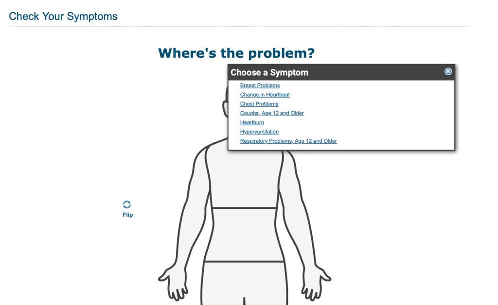
✦ Symptom Checker too many clicks: The amount of user click and clickable areas on this functionality is too much that for the end user it is an increase in cognitive load and may lead to user frustration
✦ Expanded Body Part Categories: Break down body parts into more specific subcategories for targeted symptom input.
✦ Body Model limits the user input can it accept
Key Observations
Originally we were seeking to analyze the homepage as well but this proved to be too broad.
We are currently focusing improving upon specifically the symptom checker, improvements for any other part of the site that would not apply to the symptom checker were analyzed and removed during the card sorting process
Information
Architecture
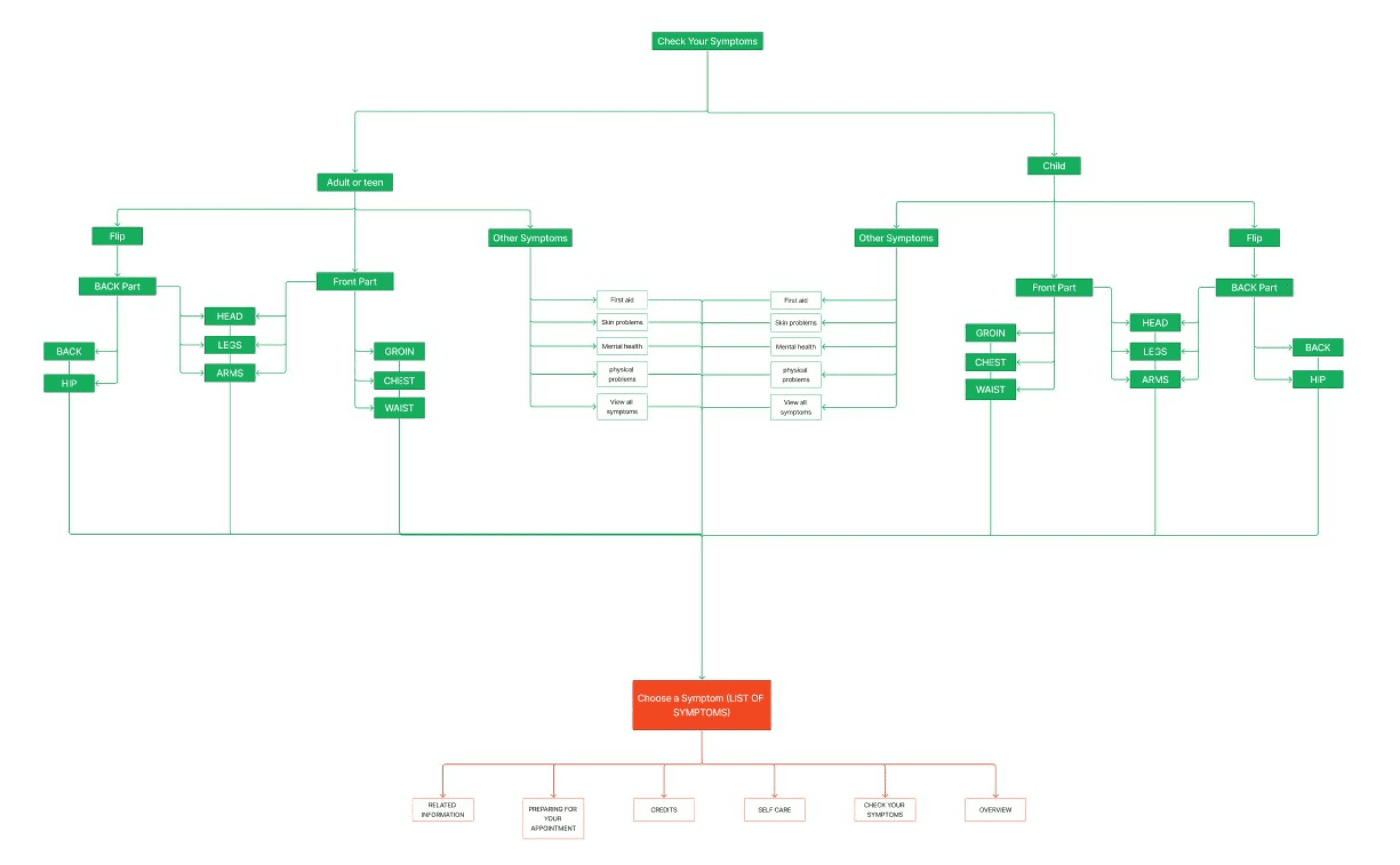
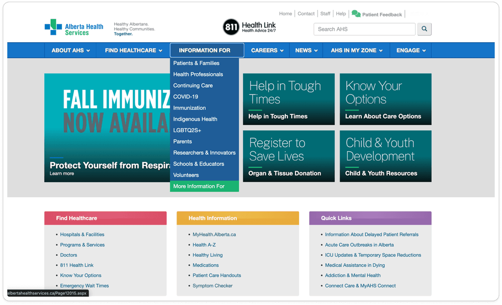
Current Information Architecture of the Alberta Health Services Website
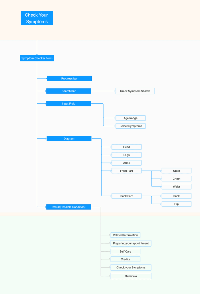
Improved Information Architecture
White part: Symptom Checker Page
Green part: Result Page
Proposed changes
with rationale:
✦ Relocate the symptom checker to the home page and navigation bar
✦ Increase the size of clickable icons like the flip button and font size changing buttons in the symptom checker
✦ An option to have the symptom checker tool into a form instead of clickable model
✦ Ability to add multiple symptoms to have more detailed and accurate assessment
https://myhealth.alberta.ca/health/Pages/conditions.aspx?hwid=hwsxchk
Conclusion
✦ Proposed changes to the Alberta Health Services Symptom Checker include increased visibility, larger buttons, multi-symptom input, and a streamlined, single-level information architecture.
We’ll prototype, test, and refine these improvements, focusing on fewer clicks and a mobile-friendly layout.
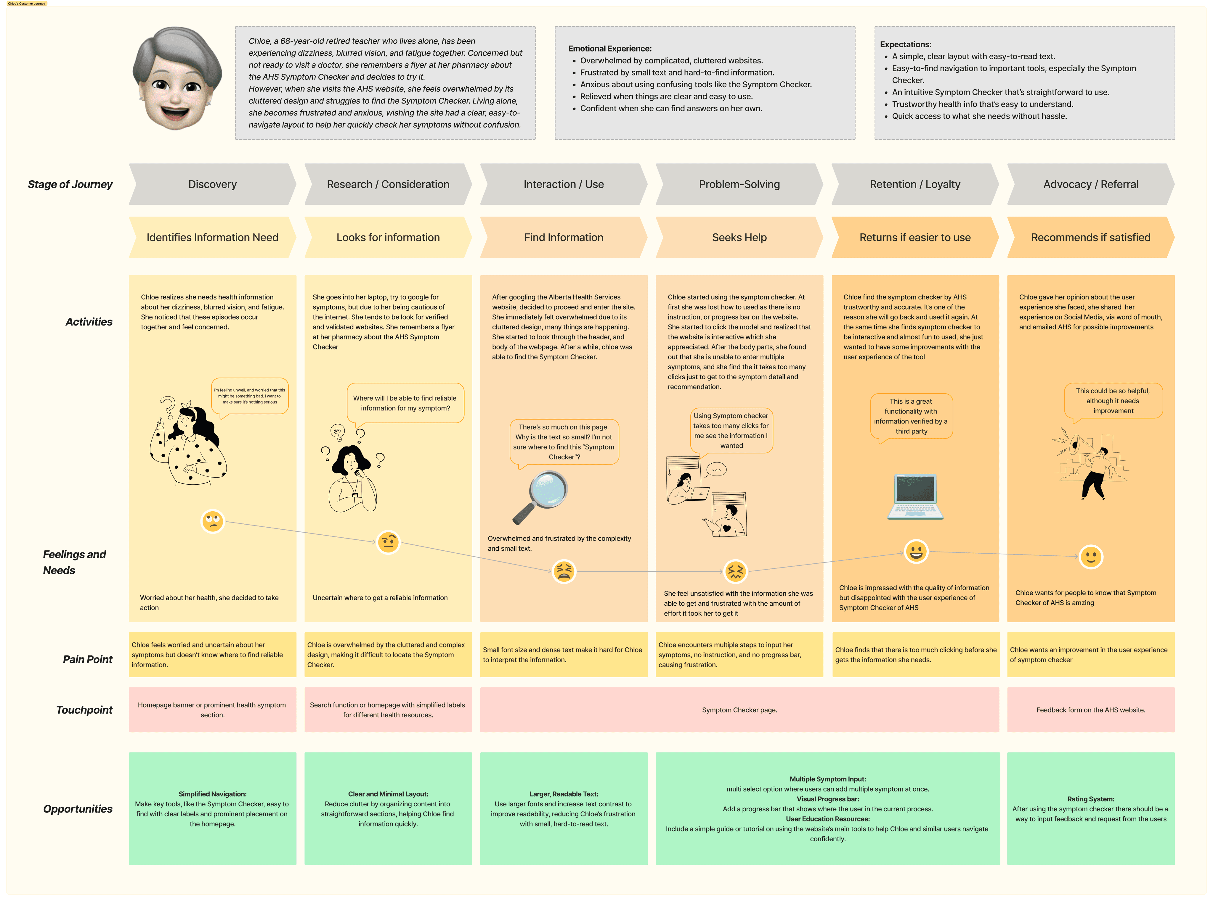
User Journey

Chloe, a 68-year-old retired teacher who lives alone, has been experiencing dizziness, blurred vision, and fatigue together. Concerned but not ready to visit a doctor, she remembers a flyer at her pharmacy about the AHS Symptom Checker and decides to try it.
However, when she visits the AHS website, she feels overwhelmed by its cluttered design and struggles to find the Symptom Checker. Living alone, she becomes frustrated and anxious, wishing the site had a clear, easy-to-navigate layout to help her quickly check her symptoms without confusion.
✦ Emotional Experience:
- Overwhelmed by complicated, cluttered websites.
- Frustrated by small text and hard-to-find information.
- Anxious about using confusing tools like the Symptom Checker.
- Relieved when things are clear and easy to use.
Confident when she can find answers on her own.
✦ Expectations:
- A simple, clear layout with easy-to-read text.
- Easy-to-find navigation to important tools, especially the Symptom Checker.
- An intuitive Symptom Checker that’s straightforward to use.
- Trustworthy health info that’s easy to understand.
Quick access to what she needs without hassle.
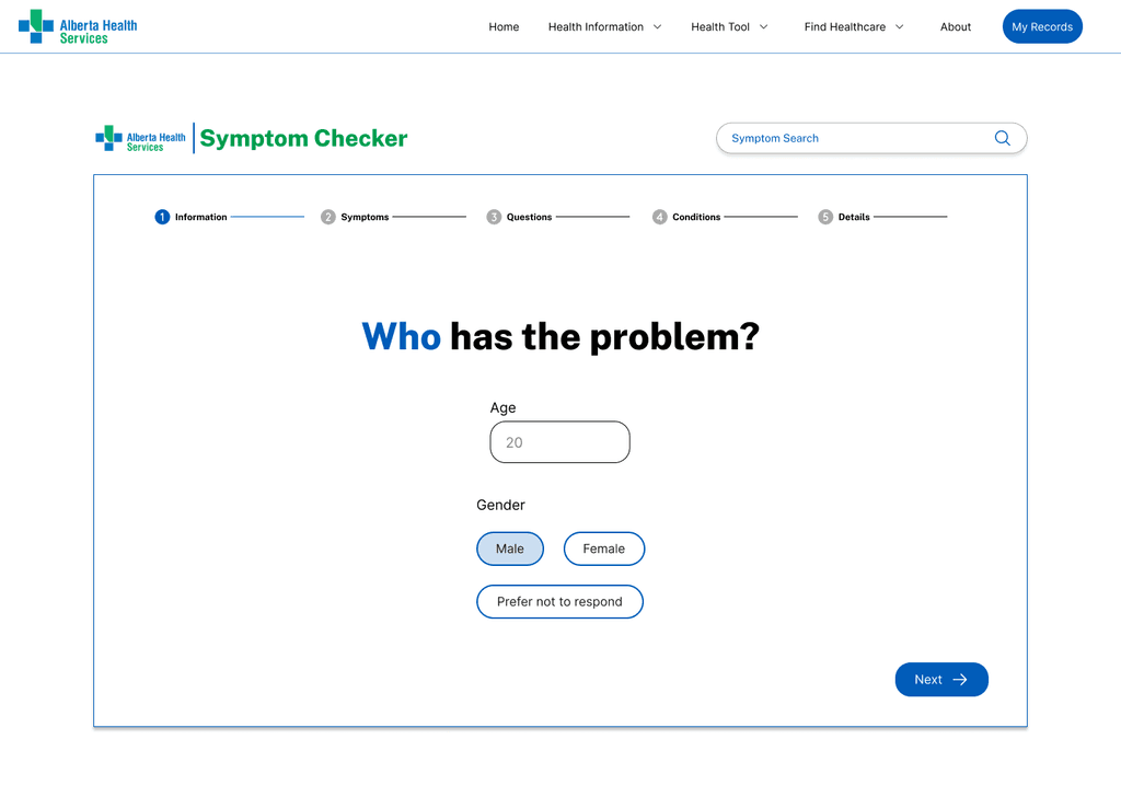
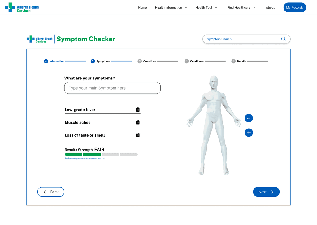
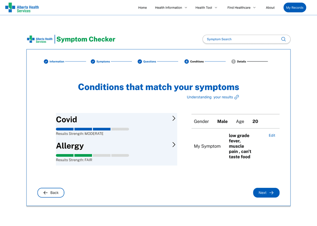
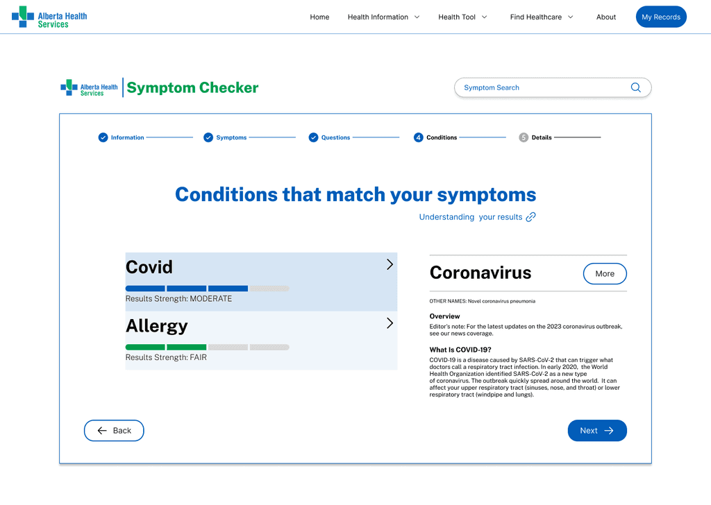
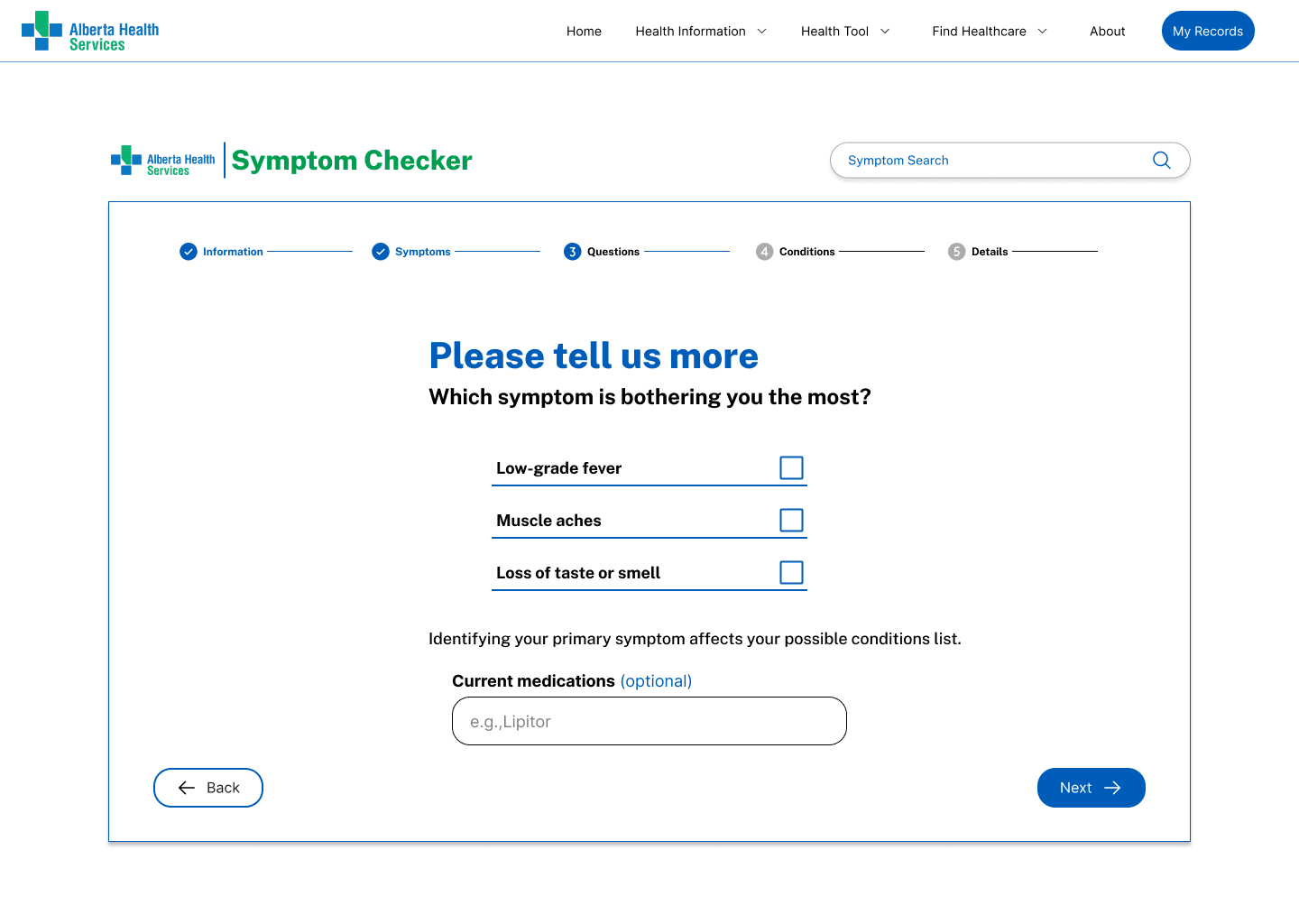
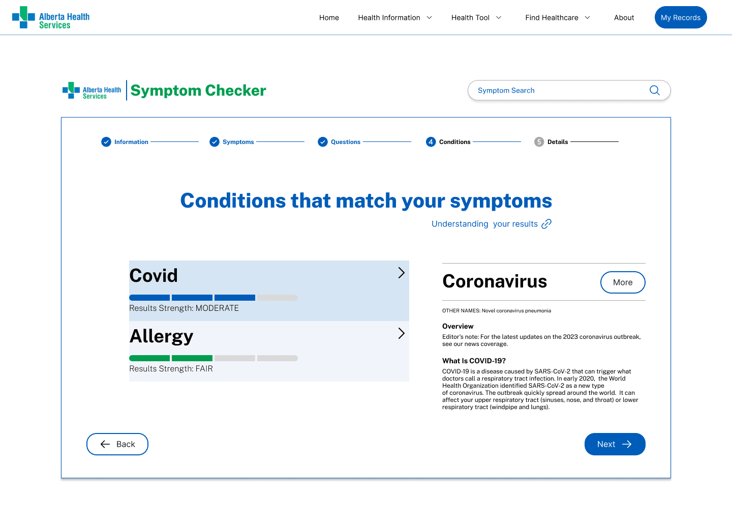
Final Design
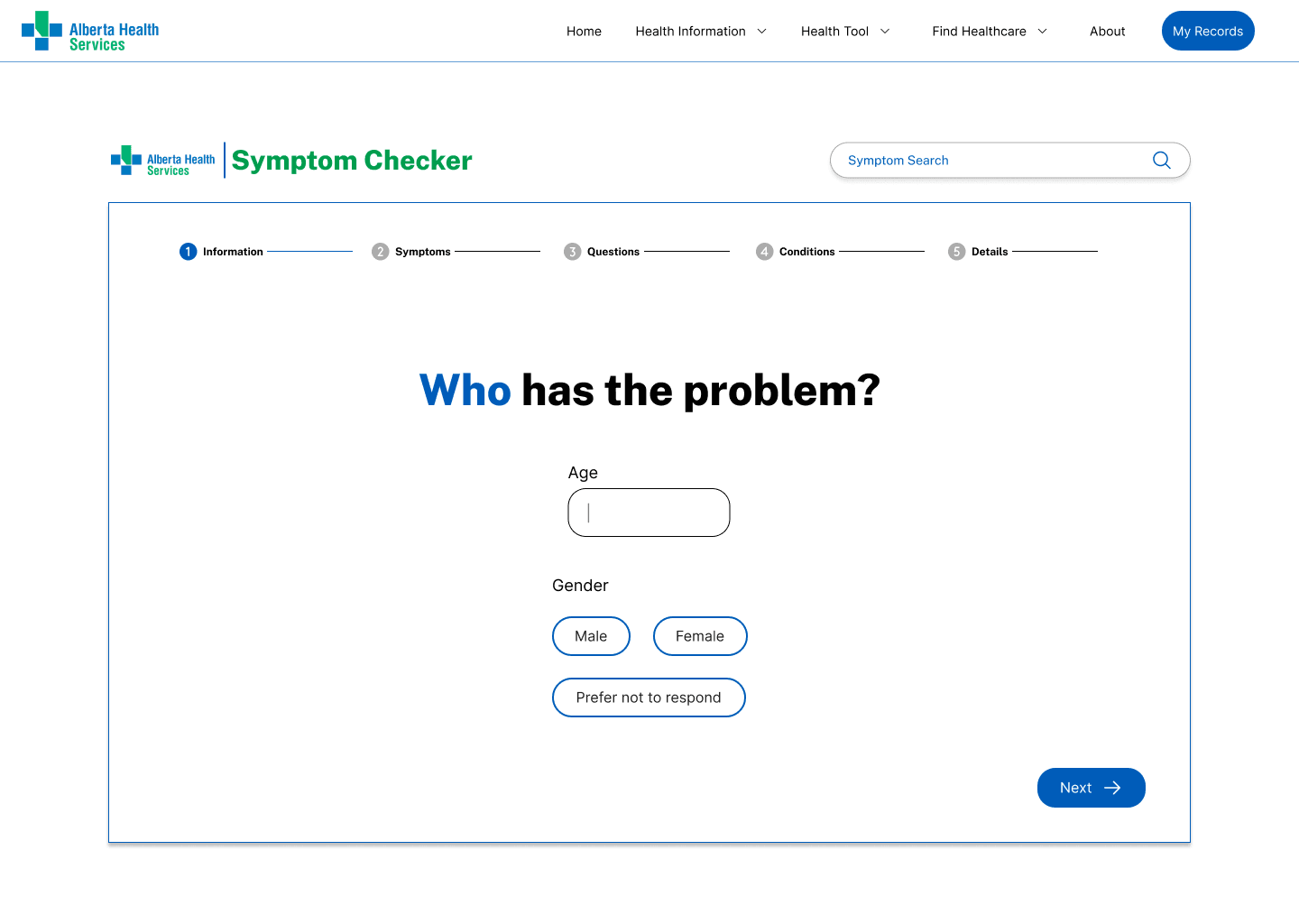
The initial design simplified the navigation bar, making it more user-friendly.
By clicking on "Health Tools" in the navigation bar, users can now directly access the Symptom Checker. All design elements follow the Alberta Health Services (AHS) brand design guidelines to ensure consistency.
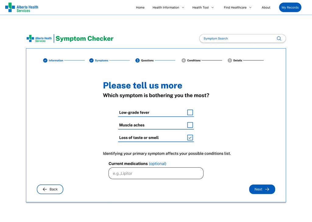
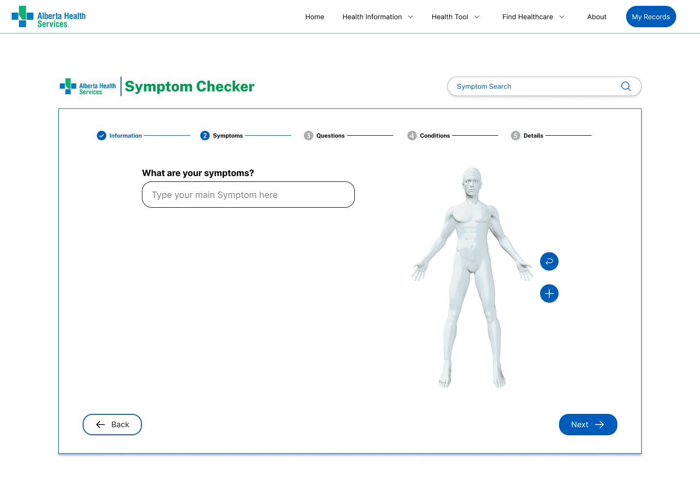
In addition to allowing users to select symptoms by clicking on body part images, the design also enables them to type and add specific symptoms, offering a more flexible and intuitive way to input information.
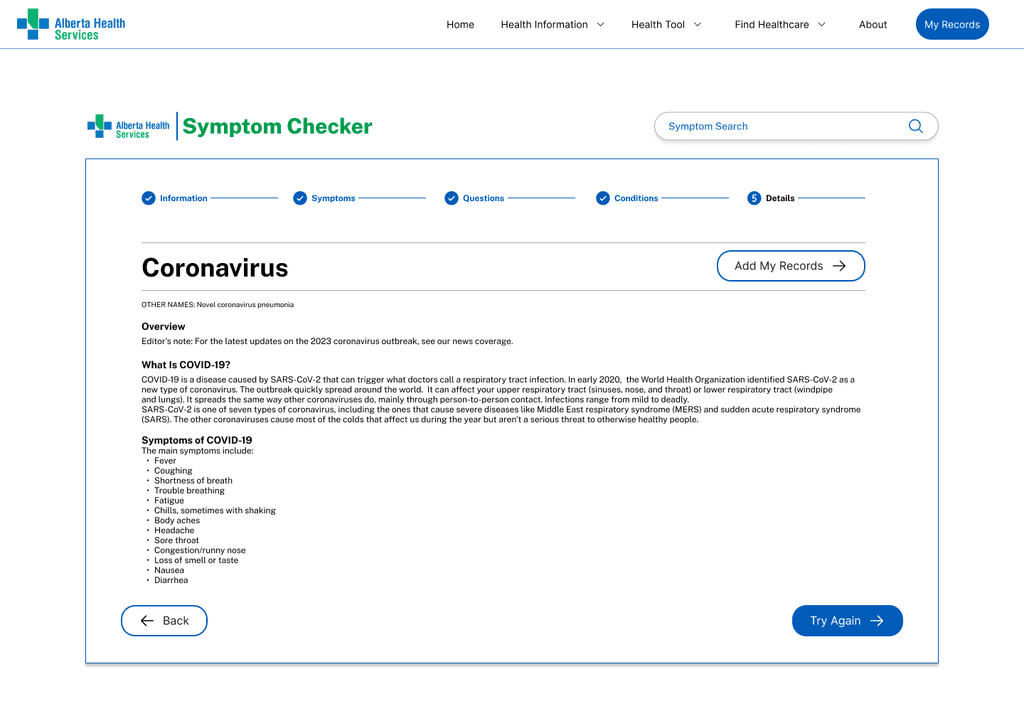
A progress bar has been added above the Symptom Checker, giving users a clear view of where they are in the process. This feature also allows users to easily add, remove, or edit symptoms at any stage.
The clean and modern layout emphasizes clarity and functionality, transforming the AHS website into a more user-friendly platform.